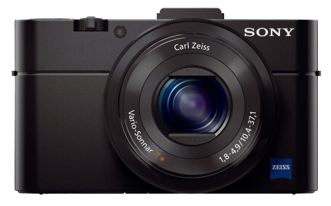
The Sony RX100 II has been called by many the best pocket camera. In this episode of All About the Gear, Frederick Van Johnson and I explore why.
The Sony RX100 II has been called by many the best pocket camera. In this episode of All About the Gear, Frederick Van Johnson and I explore why.
 I love this camera. As with their X100S (read my review), the X-E1 is another example of how Fujifilm can make a camera with almost everything just right. Frederick Van Johnson and I discussed the X-E1 on episode #8 of All About the Gear.
 Although much of the buzz this year has been about small, mirrorless cameras, the big-boy DSLR makers (Nikon and Canon) haven’t been entirely asleep at the switch. The new Canon 70D is most notable for it’s groundbreaking Dual Pixel CMOS autofocus sensor, which is used in video and Live View modes. The Canon 70D and an explanation of autofocus technologies are the topics of this episode of All About the Gear.
In the first part of my review I compared the bodies of the Sony NEX-6 and NEX-7. As I mentioned then, my motivation for these reviews is to find the best way to “travel light” for a non-photographer’s trip to Turkey in June. I already own an NEX-7 with two lenses, but I wanted to (a) check out the NEX-6, and (b) find the best suite of lenses for this non-assignment. This post is all about the lenses.
Here are the six lenses I’ve used for the past four days and my comments on each:
Two lenses (the 16-50mm and the 16mm) didn’t make the cut. Here’s the plan for what I’ll be taking to Turkey, at least as of now:
Here’s my logic. The 18-55mm is fine as a walkaround casual lens when I’m outdoors in the daytime and not in my serious-photographer role. The wide-angle 10-18mm zoom is a perfect compliment to the kit lens with the crossover between them at 18mm (27mm full-frame equivalent). But when I move indoors, need more light and don’t want to crank up the ISO, or when I simply want to spend more time on a subject, I find I switch to the 50mm or the Zeiss 24mm primes.
The only lens I’m missing in this set is something telephoto. The 18-200mm superzooms (11x) are just too large to meet my “travel light” criterion. But with a 24MP sensor on the NEX-7 I always have the option of cropping. If I shoot at 55mm and crop 2:1, it’s the same as though I had used a 110mm lens, which is the equivalent of 165mm on a full-frame camera. And I still end up with a 6MP image, which is fine for posting online and prints up to 8×10.
If you’re thinking of buying one of these bodies or lenses (or any others for that matter) I strongly recommend renting first. Personally, I use BorrowLenses.com, but LensRentals.com and even your local camera shop are good, too. For example, the two lenses I’m taking to Turkey that I don’t already own would cost me about $2,000 total to purchase. To rent the pair for four weeks will cost me only about $225.
There are always surprises with gear. There’s always something the reviews didn’t tell you or you just missed. Rent for a 3-day weekend and it won’t cost you much. I think you’ll be glad you did.
[Spoiler alert: If I had to buy today, I’d go for the NEX-6 over the NEX-7. (Yeah, I know: I’m in the minority on this one.) But if you can wait two months, the rumors are that there will be an update to the NEX-7 that will hopefully tip the scales in that direction.]
I’ve been shooting with a Sony NEX-7 on and off for nearly a year, alongside my big Nikons. (See my earlier NEX-7 review.) Although I think of the Nikons as my serious cameras, the fact is that when I looked back at the end of 2012, many of my best images were captured with the NEX-7.
When I leave home for a shoot (even a photowalk) I tend to take at least one body and far more lenses than any reasonable person would be willing to lug around. For a recent trip to Death Valley, I even brought along two tripods. (How dumb is that?) But my wife and I are taking a non-photographer’s trip to Turkey in June, and I’ve decided I want to try traveling really light. As frightening as that sounds — and it does, to me! — it means leaving the Nikon bodies and glass at home. I’m already losing sleep over this. It’s not about the gear. It’s not about the gear…
Since buying the NEX-7, I’ve often wondered if I might have been better off with a micro four-thirds camera. So many friends love them. So I got my hands on an Olympus OM-D E-M5 for a review. Bottom line: Although I made the mistake of testing the OM-D with inferior lenses, I certainly didn’t like the camera any more than I like the NEX-7. The one advantage of the OM-D was the array of superior lenses (which I didn’t test!) for the micro four-thirds system. Sony has been properly criticized for a lack of good ones.
But in the past year Sony has released new lenses. I’d also read positive reviews of the newer NEX-6 and was curious how it stacked up to the -7. And that’s the genesis of this review. I wanted to check out the -6 and some better lenses, ultimately to decide what to take to Turkey. I’ll cover the bodies in this review and save the lenses for a separate post.
Take a look at the DxOMark comparison of the two cameras’ sensors. They’re about as close as they could be, and that confirms my subjective experience. Although the NEX-7 is 24MP and the NEX-6 is only (!) 18MP, they’re both excellent. If anything, 24MP is a bit much for casual photography, particularly if, like me, you always shoot in RAW mode. (I know that five years from now that will sound ridiculous.) If image quality isn’t enough to differentiate these two bodies, what is?
The advantages of the NEX-6 are:
So what’s so good about the NEX-7?
As I think you can see, my feelings are that the NEX-6 is, overall, a better camera with the most important differences being the controls and the improved autofocus. I’m not switching from the NEX-7 now, but if Sony combines the best of both in an updated -7, I’ll probably bite.
Here’s Part 2: Sony NEX: The Lenses
Last year I posted a review of Labs and Papers for Black & White. At that time I was using outside labs for all my prints. Based on my ongoing frustration with the results, I decided to start making my own prints and purchased an Epson 3880 printer for the task. With advice from Martin Bailey and his great eBook, Making the Print, I focused on high-end fine-art matte papers. I’ll be posting reviews of many of these matte papers soon, but first I want to cover glossy papers.

Why am I using glossy papers, particularly after Martin convinced me to check out the matte papers? It started when I entered the above image into a local competition that was judged by printing guru Mark Lindsay. I entered a print on Breathing Color’s Optica One. Mark liked the image, but he bumped it down to second place because of the choice of paper. He noted it was a particularly sharp image with a fairly wide gamut, and that it really needed a high-gamut smooth glossy paper. He was absolutely right. My problem was that I had been so focused on matte papers, I’d been using them for everything. BC’s Optica One has a wide color gamut and high d-max (ie, dense blacks), but as Mark explained, the range of what you can reproduce on glossy papers fundamentally exceeds what you can do with matte papers.
I ordered sample packages from five manufacturers. Yes, there are many others, and when I get a chance I intend to test a few more. But for now I used 19 gloss, satin and lustre papers from Breathing Color, Hahnemühle, Ilford, Red River and Epson. For these tests I printed two images, the one above and the one below. I chose the one below because it contains some extreme colors that are out-of-gamut for any paper.

For each paper I used the ICC profile provided by the paper manufacturer for my printer. I started with the full-gamut sRGB images, soft-proofed them in Lightroom 4, and adjusted the saturation to bring the images to be within gamut for each individual paper. In some cases I changed the exposure in order to best approximate the original.
Most important is that my judging of the results was entirely subjective. Yes, I checked for (but did not measure) the density of the blacks, detail in the highlights and shadows, and the accuracy of the colors. But I also just looked at the prints and decided which ones I liked best. Many of these papers are quite similar, particularly those from the same manufacturer. In an attempt to minimize arbitrary judgmental differences, I compared the papers blind (ie, unlabeled) four times, using each of the above images in two different lighting conditions. Luckily, when I was all done I discovered I’d been fairly consistent in my rankings. In all four comparison passes I chose the same papers as my favorites, although within the top four papers they were particularly close. Likewise, I was consistently disappointed with the bottom six or seven. In the middle of the rankings the order did change somewhat more from one judging pass to another. Of course these are my personal preferences and only for these two images, which are notably colorful, saturated, sharp and contrasty. What’s right for you and your images will likely be different, but I hope I can give you a good place to start in your search for the best glossy papers. Here are the results, in order of my preference.
Conclusions: I’ve settled on Breathing Color’s Vibrance Gloss as my everyday gloss paper. It’s one of my top picks regardless of price and is available now for nearly half the cost of Epson’s Ultra Premium Lustre, one of the most common papers. I’ve also purchased some large sheets of Hahnemühle’s Fine Art Baryta for situations that call for the very best.
If you’re interested in glossy, satin or lustre-finish papers I strongly suggest you buy sample packs from at least some of these manufacturers and run your own tests. My experiments are far from technically rigorous and my images probably don’t look anything like yours. Running your own tests is the only way to decide.
If you have the ability to make your own paper/printer ICC profiles rather than depend on those from the manufacturers, you may want to do so. For example, I found that using the profiles from Hahnemühle yielded prints consistently lighter than using manufacturer-supplied profiles for other papers. Although my monitor is calibrated, I don’t have a reflective spectrophotometer needed to read test charts on paper.
I also come at this with my own set of prejudices. For example, I just don’t like lustre papers. While they may be the most resistant to fingerprints (from which glossy papers suffer) and smudging (the curse of matte papers), I don’t like the way they scatter light. I prefer a smooth-finish matte paper or a smooth glossy. I was, however, impressed with some of the satin finishes. (If you do print on glossy or matte papers and expect your prints to be handled such as during competitions, I strongly recommend Hahnemühle Protective Spray.)
Finally, I found that the greatest variations are between the manufacturers. For example, within the Red River line of papers, I had a very difficult time reliably distinguishing Arctic Polar Gloss from Pecos River Gloss and Ultra Pro Gloss. The same is true among the Hahnemühle Baryta papers.
I hope this has been helpful as you explore the beauty of these great glossy papers.
Okay, so this has nothing to do with the topics I usually blog about, but I happen to be here in Las Vegas for the New Media Expo this week. I took advantage of the trip and brought my wife along with the enticement of seeing two Cirque du Soliel shows. Even if you’re not a Cirque fan, this is for you.
There are actually six very different Cirque du Soleil shows Las Vegas, and I’d guess the most-popular one is ‘O‘, although ‘Love‘ may have taken over that honor. We saw ‘Love’ tonight. It’s essentially a typical Cirque du Soleil show based on the music of the Beatles in a huge theatre. This isn’t your typical circus-in-a-tent show like the traveling Cirque du Soleil. Shows like these can’t ever tour — the theatres are essentially built uniquely for them. Perhaps the best part of ‘Love’ is that they’ve absolutely perfected the techniques of flying people around a large theatre at high speeds on wires, trapeze and bungee. It’s not just dramatic, it’s also incredibly graceful. Overall, the show is a bit confusing, and I think it’s fair to say that perhaps it emphasizes the psychedelic aspects of the Beatles’ lives and music. The show is extremely trippy, and as my wife agreed, I wouldn’t be surprised if lots of people come stoned. There’s so much going on at once, it can be difficult to know what to watch.
If I’d only seen ‘Love’ while here in Las Vegas, I wouldn’t be writing this post. The reason I’m blogging is the Cirque du Soleil show we saw last night: ‘KÀ‘. I’d never heard of it before. I bought the tickets only because I couldn’t get them for ‘O’. But I’ve got to say, ‘KÀ’ is one of the most amazing theatrical events I’ve ever seen. (Note: My wife and I are both former drama majors.) The starting point for ‘KÀ’s greatness can be summarized in one word: hydraulics. It’s in a massive theatre, seating maybe 4,000 people. The proscenium is perhaps 80-100 feet high. But the major element of the set is a fully articulated platform that’s something like 40×60 feet. Maybe even larger. The platform starts out at floor level, but imagine your flatscreen TV with one of those VESA mounts on the rear with an arm that allows it to be turned and twisted in three dimensions. Then imagine it flipping vertical (or even past vertical), loaded with a cast of dancer/acrobats. Effortlessly and silently, it becomes the size of a six-story building. Two of the most amazing scenes are performed in this vertical position. This photo of one of those scenes doesn’t really do it justice. The wall is, in fact, vertical and the performers are not wired. I won’t even try to describe some of the uses of this platform. And don’t think it’s gimmicky — it’s not. The set and staging would be way over-the-top in other contexts, but it all works seamlessly here. The video trailer also undersells the show.
Don’t get me wrong. This isn’t just about a set design. Everything about this show is superb, cast included. Lighting, sound, music, choreography (martial arts including Capoeira) — all superb. It’s been running for a year, two shows/day five days/week, which means over two million people have seen it. But I think it’s Cirque du Soleil’s sleeper show here. If you’re going to Las Vegas and can afford the tickets, this is the show I’d recommend.
Update: Here’s a trailer on YouTube that shows a bit more. Think of “martial arts meets steampunk.” Wikipedia says the platform is 25×50 feet and weighs 50 tons. Writing in the New York Times, Steve Friess called it “Metrolpolis meets Blade Runner” and says the theatre cost $135 million to construct and holds 1,950 seats.
