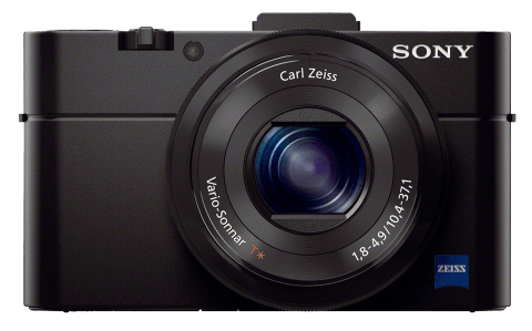
Sony a7 (and a7R)

The long-anticipated Sony a7 and a7R have been called the cameras of the year by some. I was an early fanboy, but does the a7 live up to the hype and my expectations?

The a7 and a7R are the first full-frame, mirrorless, autofocusing interchangeable-lens cameras. Together, they’re strong competitors for the Leica 240 and the Nikon D800E. But the native lens selection is meager. The sweet spot may be to combine the new Sonys with third-party lenses.
Continue reading

Prime or Zoom?

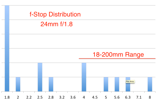
In a comment to my previous post, Dan Dawson asked, “I’d be curious, of the shots taken with the primes, what apertures were used in the shots you kept… were they wide open at f/1.8 or did they wander up in to the range that your zooms could have handled?” Good question. Here are those data:

Screen Shot 2013-06-29 at 4.56.23 AM


The chart shows the distribution of images I shot with a Zeiss 24mm f/1.8 using a Sony NEX-6 on a recent trip to Turkey. These are the images I actually published — 16 out of 907 taken with that lens. The chart also highlights (via a horizontal red line) images that could have been shot with the 18-200mm f/3.5-6.3 superzoom, which opens to f/4 at 24mm.

Admittedly, the sample is a bit small. I did the same for the 50mm f/1.8 and the numbers were even smaller and therefore less conclusive.

Which Lenses Did I Actually Use?

Two days ago I posted a lengthy article about the photo gear I took to Turkey. But I was still curious which lens(es) I might have been able to do without if I had to do it all over again. To be objective I logged the EXIF data to see the focal lengths of the first 94 images I published from the trip (out of 4,200 taken). They’re a good sample and generally the best of what I shot. Below is a chart showing the results.

Screen Shot 2013-06-28 at 2.41.01 PM

This is a histogram/scatter chart. (Thanks to Ian Leslie for his suggestion of a better way to display these data.) Click to enlarge it. The vertical scale is focal length (logarithmic). The bottom is 10mm and the top is 200mm. There’s no horizontal scale, just 94 horizontal positions, one for each photograph. So just consider the height of the blue diamonds and how they cluster. I added two horizontal red lines to highlight the two prime lenses: 24mm and 50mm. And on the right side there are two vertical lines showing the ranges of the two zooms.

I used four lenses, the ranges of which are shown above in red:

  • 24mm f/1.8
  • 50mm f/1.8
  • 10-18mm f/4
  • 18-200mm f/3.5-6.3

So what conclusions can I draw? As I expected, the 24mm was more valuable than the 50mm. But if I hadn’t had the 10-18mm or the 18-200mm, there are a lot of shots that wouldn’t have been captured, at least not the same way. From this chart, I don’t see anything that would convince me to change the lenses for the next trip, but it was an interesting experiment nonetheless.
Blend Modes in Photoshop

Last week we started an Advanced Photoshop SIG (special-interest group) at our local photo club. Based on a survey of our members, I chose Blend Modes as the topic for our first meeting. Here’s a cleaned-up version of the notes I used in preparation.

Here’s an image of 0%/25%/50%/75%/100% that you can use in a layer to see the monochromatic effects of blend modes. (Public domain. Click to enlarge.)

For example, here’s the above image in Overlay mode over another image. Note that in this mode, black darkens the image, white lightens the underlying image and 50% gray causes no change.

Here are some tutorials and tools:

(Thanks to Scott Loftesnsess for his recommendations to the above list.)

These are some of the techniques I demonstrated:

  • Scrolling Through the Blend Modes: Select the layer you want to change in the Layers palette. Select the Move tool. Use Shift- and Shift+ to scroll through all the blend modes and see their effects.
  • Difference Mode: Just as a demonstration of the more obscure and creative blend modes, set your brush to white in Difference mode at 20% opacity and paint directly on your image or a copy. Now change the brush to 100% and see what happens. (Don’t forget to return your brush’s blend mode to Normal, otherwise you’ll wonder why it doesn’t work correctly later on.)
  • Dodging: Duplicate the image, set to Screen mode, add a black mask and paint on the mask with 20% opacity white.
  • Better Dodging (Levels Adjustment Layer Trick): Duplicating your image in a new layer substantially increases the size of your .psd file, so instead of the above, try dodging this way: Add a Levels adjustment layer set to Screen mode. Paint 20% white on a black mask. Just as easy as above, but your layered files will be smaller.
  • Burning: Add a Levels adjustment layer set to Multiply mode, paint on a black mask with 20% white.
  • Even Simpler Dodge & Burn: All of the above are just experiments to show various options, but perhaps the best way to dodge and burn is to create a new blank layer set to Overlay mode, but don’t change the levels. (It’s just a dummy adjustment layer.) Paint with 20% white to dodge and 20% black to burn. Your file size will be small and the technique is totally non-destructive and reversible. You can erase your adjustments using the Eraser tool or a brush set to 50% gray color.
  • Exposure Control w/Gradient: In a new layer, draw a black-to-white gradient from top to bottom. Set to Overlay mode and adjust the opacity. While this works, you can’t move or change the gradient. So instead…
  • Gradient in a Layer Style: Don’t create a new layer. In the image layer, open the Layer Styles dialog (fx icon at the bottom of the Layers palette or just double-click in the blank space to the right of the layer’s title). Select the Gradient Overlay and (!) check the box. Select a black-to-white gradient (click the Reverse checkbox if necessary), set the gradient style to Linear. Play with Scale and Angle. Then switch the blend mode (of the gradient, not the layer) to Overlay and adjust opacity. Note that you can drag the gradient in your image area to reposition it! Now you have a non-destructive, changeable gradient tool.
  • Vignette in a Layer Style: Like above, but use a black-to-transparent gradient instead of black-to-white and the Radial gradient style. Experiment with the Overlay vs. Soft Light blend modes and the opacity. Unlike Lightroom you can’t change the squareness/roundness of the vignette, but that’s outweighed in some cases by that fact that you can reposition it.
  • Increase Luminosity Contrast: Duplicate the layer, set to Overlay blend mode and adjust the opacity. Works, but it pushes the lights and darks to extremes.
  • Better Way to Increase Luminosity Contrast: Duplicate the layer, from the menus select Image->Adjustments->Desaturate. Change the blend mode to Luminosity and adjust the opacity. You can also use a curves adjustment (to this layer only) to increase the contrast of the desaturated image and even use a mask to selectively add contrast in only certain areas of your image.
  • Even Better Way to Increase Luminosity Contrast: Use the Channel Power Tools plugin (see above) to preview all ten channels (RGB/Lab/CMYK). Select the channel that shows the most contrast in the desired portion of your image. Create a new layer and use CPT to apply the selected channel to that layer. (Or use Image->Apply Image… from the menu.) Select Image->Auto Contrast if necessary to quickly get a contrasty version, particularly if you selected either the Lab “a” or “b” low-contrast channel. Set the blend mode to Luminosity and adjust the opacity. Again, you can apply a Curves or Brightness/Contrast adjustment and a mask as above.
  • High-Pass Sharpening: Duplicate the layer. Select Filter->Other->High Pass… from the menu. Adjust the radius to define edges. Use a curves layer or Image->Auto Contrast or a Brightness/Contrast adjustment layer to increase the contrast, then set the blend mode to Overlay, then adjust the opacity.

I hope you find some of these techniques useful and that they help you understand the power of blend modes in Photoshop. Feel free to leave your feedback here.