Workflow: The NDOC “Tree Tunnel” Image

This image I made of a very popular location here in Marin County, California, generated a lot of online feedback. Because I used such a variety of post-processing tools and techniques, I thought it would be an interesting exercise to explain the workflow here. This presentation is an experiment and I look forward to hearing what you think of this format, particularly compared to screencasts and videos.

The slideshow below contains an image for each step in my process. If you hover over it you can pause it or move it forward or back. Below the slideshow is a scrolling area with the corresponding explanations. Click on any image to see it 2x larger. It should work on your mobile devices, too.

[slideshow_deploy id=’3305′]


  1. Original. This is the original image, converted without adjustment from a RAW file. Fujifilm X-E1, ISO 400, XF 18-55mm f/2.8-4 R LM OIS, 1/640 second, 55mm, f/5.6.
  2. ACR Basics. My preliminary work in Lightroom or Adobe Camera Raw is just to correct for lens distortion and to map the medium dynamic range RAW file down to the low dynamic range 16-bit image that is used in Photoshop. Here I reduce contrast and recover as much shadow and highlight detail as I can coax out of the RAW file. My goal is to end up with a low-contrast flat image.
  3. Endpoints. The previous step typically yields weak blacks and highlights. Now in Photoshop, I start by spreading the luminosity of the image across the entire dynamic range using a curves adjustment layer to set blacks about RGB=2 and whites at RGB=253. I skipped white-balance correction for this image because I knew I was going to B&W, but this is the point at which I would do that for a color image.
  4. B&W Conversion. I created a SmartObject copy and used Nik’s Silver Efex Pro 2 for the conversion to monochrome. With a more colorful original I typically start by adjusting the color sliders to control each color’s contribution to the b&w version, but in this case I made no global adjustments (color, contrast, brightness, structure, etc.) at all. Instead, I used about a dozen control points in the dark areas of the treetops to bring out some detail there. I also reduced brightness and increased the contrast of the building at the end of the road. I could have done these later, back in Photoshop (I did, in fact), but it seemed like a good time to deal with these issues.
  5. Levels. I’ll often drop in a levels adjustment layer to keep the white/black endpoints under control. Here I also increased the overall contrast after the b&w conversion.
  6. Dodge/Burn Roadway. I didn’t like the lightness of the road. I thought it attracted too much attention to itself rather than supporting the overall composition of the image. (You can switch back and forth between 5 and 6 to make up your own mind.) I also thought the splotchiness from shadows on the asphalt were distracting because they broke up the continuous flow of the roadway’s leading lines. This was a complex step using two curves adjustment layers and luminosity painting, a technique I learned from Tony Kuyper. One curves adjustment layer darkens (burns) the roadway and the leaves near the trees. The second curves layer lightens (dodges) a strip between those areas. The overall effect is to darken and even-out the roadway while increasing the contrast and strength of the lines leading to the building at the end of the road. Once I was done, I decided it was too strong, so I backed off the opacity of the two grouped layers to 78%. The advantage of using luminosity painting or a luminosity mask when dodging and burning is that you can retain and even increase contrast/detail in those areas.
  7. Mid-tone Contrast. So much of this image is in the mid-tones, so I brought out a bit more using a curves adjustment layer with a Basic Midtones luminosity mask.
  8. Dodge/Burn Trees. The light here was beautiful but unusual. Because of overcast skies and the dark canopy of trees, the trunks are actually getting side light from both sides. I wanted to increase the tunnel effect, so I didn’t want too much light on the insides of the tree trunks, particularly in the foreground. That one tree in the left foreground almost looked like it was hit with a strobe. (Compare to step 7.) As with the roadway (in step 6) I used two curves adjustment layers and painted with brushes loaded with luminosity mask selections. This is another good stage to compare, back and forth, with the previous one. It may look like I’m removing contrast and focus from the left and right sides of the frame, which is true. But I’m doing so to focus the viewer’s attention on the center.
  9. The Building. Although it’s not realistic — an overcast sky is almost always the brightest part of an image — I wanted the building at the end of the tunnel to be slightly brighter than the sky. Here I used a curves adjustment layer with an edited luminosity mask to brighten and increase the contrast of the building. After tweaking, I reduced the opacity of this layer to 39%.
  10. The Sky. To complete the effect above, I used another luminosity mask and a curves adjustment layer to darken the sky to just below the level of the building. I ended up weakening this effect too, backing off the opacity to 62%.
  11. Vignette. I wanted to darken selected areas, particularly around the periphery, so I painted with a very weak black brush into a new layer in Soft Light blend mode. Opacity 41%. I didn’t use a luminosity mask here because I didn’t want to maintain or enhance the contrast or detail.
  12. Touch-Ups. I should have done this much earlier in the process, but there were a few bright objects in the close foreground and on the roadway that were driving me crazy. I used a new layer and a combination of the Clone Stamp and Healing Brush tools to get rid of them. It’s hard to see unless you toggle between images 11 and 12 and look closely, primarily at the lower-left corner. I always use these tools in a separate layer because they’re then non-destructive and I can use the Eraser tool on them.
  13. PPW Sharpening. I frequently use the Sharpen 2013 action from Dan Margulis’ Picture Postcard Workflow, version 3.3. In fact, many of the steps in this workflow I learned from Dan. I ran the sharpening action on a copy of the image, flattened that image, then copied it back to a new layer in the original image. Rather then adjust the sharpening in that second (temporary) image, I often just keep the defaults and copy it back at full/normal strength. I then reduce the effect selectively with a layer mask or (in this case) globally by reducing the opacity of this layer to 45% to avoid over sharpening. The advantage of doing it this way is that since I don’t make any changes to the output of Dan’s action, I can re-create it at any time.
  14. Levels (2nd). After so many adjustments, the white & black points are often off, so I use another levels adjustment layer and the Auto button to bring things back into line.
  15. Warm Black. I decided the image was too cool, so I used an action I developed that warms the shadows (a gradient with black as r=9, g=4, b=0). I backed it off to an opacity of 75%.
  16. Original Color. After warming the image, I decided I wanted to see just a hint of the original color: the green in the treetops and some additional warmth in the leaves along the roadside. I added a new layer with a copy of the original image at 20% opacity in the Color blend mode. The effect is very subtle.
  17. Darken. After that warming and color, the image was too light for the effect I was looking for, so I used an unmasked curves adjustment layer to darken the image overall without affecting the endpoints.
  18. Global ACR Tweaks. At the very end, I wanted to add a bit of local contrast and crunchiness, so I created a merged copy, converted it to a SmartObject, then ran Adobe Camera Raw as a filter with the following global adjustments: Exposure=+0.15, Contrast=+6, Highlights=-31, Shadows=+71, Whites=+17, Blacks=+1, Clarity=+20 and Vibrance=+29 (for color). This last step really brought the image to life with a bit of that Halloween feeling I was going for.

MVFF: I Catch a Terrible Cat (C+)

Not every movie at a film festival is a winner. My wife and I go out of our way to find films that are unusual, quirky, foreign and very likely not to be widely distributed. We take our chances, and if, at the end of the festival, we can say that half of the films we saw were “good”, then we’re satisfied. Unfortunately, the North American premiere of I Catch a Terrible Cat fell well into the bottom half of this year’s Mill Valley Film Festival.

Continue reading

Fujifilm X100S

x100s.front

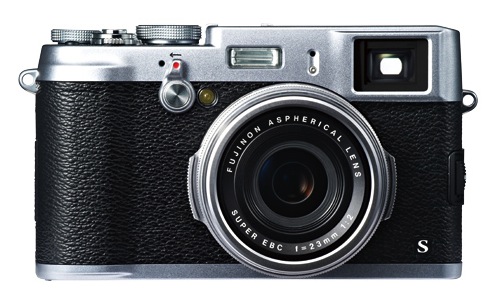
Fuji’s X100S is, so far, the hottest new camera of 2013, and Frederick Van Johnson and I reviewed it for episode #3 of All About the Gear. There’s a lot to like about this camera, but I believe the primary reason it’s so good is that Fuji listened to the users of the original X100. Because the company incorporated and exceeded many of the suggested improvements, they’ve released an updated version that is nearly flawless for the mission for which it’s intended.

Continue reading

MVFF: The Book Thief (A)

Opening night at the Mill Valley Film Festival featured a pre-release — actually, the first-ever public screening — of The Book Thief, based on the novel by Markus Zusak. I referred to it as a romantic treatment of a story we’ve seen before: WWII Germany, Nazis, Jews and (atypically) regular German citizens. It’s not romantic in the sense of romantic love, but rather “a quality or feeling of mystery, excitement, and remoteness from everyday life.” In this case it’s everyday people in very difficult circumstances.

Wow, what a way to start the festival. A superb film in just about every way. Terrific screenplay by Michael Petroni. Likewise the direction by Brian Percival, who previously directed a half-dozen episodes of Downton Abbey. This is his first feature. Geoffrey Rush is great, as usual, but the knockout performance is by a young French-Canadian actress, Sophie Nélisse. The cut we saw tonight isn’t the final mix, and I hope they tone down a few of the big-swell John Williams music moments, but that’s about the only flaw. For the most part, Williams’ score is great. It was filmed in Berlin and other than the leads, the rest of the cast are German. Everyone  — seriously, everyone — is spot on. Terrific cinematography and editing, too. So we started the 36th #MillValleyFilmFestival with an A. The Book Thief will have a few premieres on November 8, then open in New York and Los Angeles on November 15. Look for it elsewhere at the end of the year or in early 2014. Highly recommended. #MVFF

Sony RX1R

DSCRX1RB_1

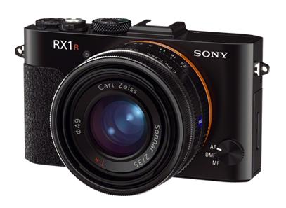
In episode #5 of All About the Gear, Frederick Van Johnson and I discuss the Sony RX1R.


The RX1R is an awesome little camera, which I very quickly learned to love. After the Leica M-series, it’s the second full-frame mirrorless digital camera on the market. Should you rush out and buy one? No, because I think Sony is about to release even better options. Let’s start with the basics.

Continue reading

(Un)Stiffed by Adobe

[Update: This issue has been resolved in my favor. It was a case of one hand not knowing what the other was doing. Although people on the Adobe Forum (including at least one forum staffer) insisted I didn’t qualify for the Photoshop Photography Program, they were in fact wrong. Not only that, but Adobe had already automatically switched my account from single-app Photoshop CC to the PPP bundle that included Lightroom 5. I accept some of the blame for not going to the My Account page on Adobe.com to check. But since I couldn’t find any info about his in the FAQs or other online Help pages, I thought I’d ask in the Forum.

Special thanks to Larry Nienkark who pointed out that he successfully received this upgrade. It caused me to check to see if I’d received it automatically as well…and I had!]

Continue reading